Today’s post is guest-contributed by my Google Summer of Code student, Alex Kuefler. He has been busy developing Fovea, the new tool for interactively investigating and analyzing complex data and models, and has a demo in the context of data dimensionality reduction to show off some new features and possibilities. It also acts as a first tutorial in how you can set up your own Fovea-based project, about which there will be more. We have recently improved support for Python 3, and the latest version can be found on github
Table of Contents
Introduction
If you’ve worked with data, you’ve probably heard of principal component analysis. PCA is one of the most widely used techniques for pre-processing high dimensional data, but for the mathematically illiterate, it can be something of a black box. This tutorial won’t show you the algebra going on inside (for that, I highly recommend this tutorial by Jon Shlens), but it will build up some geometric intuitions about what PCA is doing and demonstrate how Fovea can be used to gain such insights.
Let’s start off in everyone’s three favorite dimensions (x, y, and z) before working our way up. Consider the following dataset:
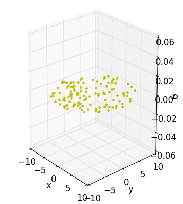
Although I’ve taken the trouble to draw this data-disc in the volume of a cube, I really didn’t need to. All the action is happening across the xy-plane with the z-axis contributing nothing to our understanding – I may as well have just appended some arbitrary coordinate to every point making up an otherwise interesting 2D object. In fact, this is exactly what I did.
Using PyDSTool’s synthetic_data tool and numpy’s concatenate function:
pts = sd.generate_ball(120, 2, 10)
pts = np.concatenate((pts,np.zeros((120, 1))), axis=1)
The end result is a list of points looking something like this:
[[ 5.94061792  3.76256284  0.        ]
[-0.86465872 -3.35053331  0.        ]
[ 3.4455166   2.50427016  0.        ]
[ 7.75243164 -5.58465333  0.        ]
[ 2.11125897  3.93196272  0.        ]
[-5.87175514  5.98995138  0.        ]
[-1.12449966  2.32071201  0.        ]
[ 2.0811796  -0.78464252  0.        ]
[ 5.65265684  0.11505331  0.        ]
[ 3.43255688  3.83145878  0.        ]]
One easily spots the slacking z-coordinate. In a perfect world, dimensionality reduction would consist of nothing more than tossing out the zeroes. But when the data have been rotated, or noised up, the problem becomes more apparent. By generating some random angles and composing the rotate_x(), rotate_y(), and rotate_z() functions (in addition to translate()) in pca_disc, like so:
trans_am = 10
trans_ax = 1

X = [[],[],[]]
for i in range(3):
    X[i] = rotate_z(rotate_y(rotate_x(translate(pts, trans_ax, trans_am),
        random.uniform(0,2*np.pi)),random.uniform(0,2*np.pi)),random.uniform(0, 2*np.pi))
We end up with a few sets of points that still sit on 2D discs, but appear to make use of three dimensions.
[[  8.2701649    6.54407486   9.43685818]
[ 10.88101268   8.97529237   8.31551898]
[ 10.87652499  10.02230807  -3.48266113]
[  4.70195135   4.70376686  -5.67127247]
[ 14.28294606  12.28493836   5.26297749]
[  7.14308586   6.18479583   2.17252043]
[ 11.8558326    9.95023447   7.14259082]
[ 10.0219924    8.51815475   4.83660148]
[ 12.01924573  11.11940641  -4.34387331]
[ 13.73158322  12.05803314   2.28344063]]
Although these data have tricked the x, y, and z axes, visualization makes it apparent that we’re expressing our data in more dimensions than we need.
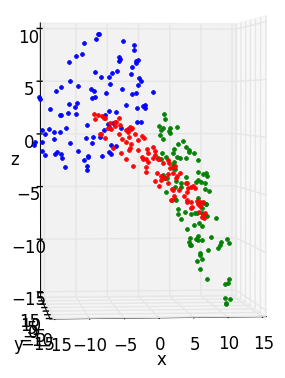
PCA’s job is to throw out the x, y and z axes and come up with a new set of axes that line up better with the data. In other words, PCA produces an ordered set of orthogonal vectors (called the principal components or PC’s), such that the first PC points in the direction of greatest variance in the data, the second in the direction of second greatest variance (constrained to be orthogonal to the first), and so forth. It is perfectly valid to come up with a new set that has the same number of vectors as the old one, thus capturing ALL the data’s variance. But the real fun happens when we ask ourselves if we can get away with having fewer axes (dimensions) than we started with.
In pca_disc, it is apparent that the two measly a and b axes can capture the same amount of “interesting stuff” as all three, x, y, and z axes. To convince ourselves, we’ll need some way to rapidly explore how our data look embedded in high-dimensional space and how they look after projection onto axes a and b. Together, Fovea layers and matplotlib’s subplots provide the needed utility.
Setting Up Fovea
Our goal is to set up some nice images showing the “before and after” of a dimensionality reduction as subplots in a figure window. But first we need to decide what kinds of information we want populating our subplots. For the purposes of this tutorial, the layers will correspond to different rotations of our disc and contain four different, but associated, groups of data (before-PCA data, after-PCA data, variance captured by PCA, and the PC’s themselves). Out in the wild, the user may want to reserve each layer for different clusters of a single dataset or different datasets entirely (the possibilities are endless). We can set aside some names and appropriate colors for our layers in a couple lists:
rot_layers = ['rot1', 'rot2', 'rot3']
rot_styles = ['r', 'g', 'b']
And the layers can be added to the plotter like so:
plotter.addLayer('orig_data')

for rot in rot_layers:
    plotter.addLayer(clus)
I’ve also included a fourth layer, orig_data, to house the original data-disc prior to any rotations. But before we can start populating rot1, rot2, and rot3 with data, we need a figure window and some axes over which our layers will be displayed. pca_disc provides a convenient function, setupDisplay(), which accepts a couple lists of strings (i.e., rot_layers and rot_styles) and arranges a figure with three subplots:
plotter.arrangeFig([1,3], {
    '11':
        {'name': 'BEFORE',
        'scale': [(-10,10),(-10,10)],
        'layers': rot_layers+['orig_data'],
        'axes_vars': ['x', 'y', 'z'],
        'projection':'3d'},
    '12':
        {'name': 'AFTER',
        'scale': [(-20,20),(-20,20)],
        'layers': rot_layers,
        'axes_vars': ['a', 'b']},
    '13':
        {'name': 'Variance by Components',
        'scale': [(0.5,10),(0,1)],
        'layers': rot_layers,
        'axes_vars': ['x', 'y']},
    })


gui.buildPlotter2D((14,6), with_times=False)
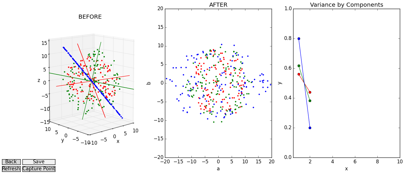
The first subplot, (entitled “BEFORE”) will be home to the original 3D disc dataset, some different rotations of the same disc, and a view of the new axes that PCA discovers for each rotation. Note that we set the ‘projection’ parameter for this subplot to ‘3d’ and supply three axes_vars instead of two. This feature is new to Fovea, and allows for provisional plotting of 3D data (with associated perks, like being able to rotate the axes by clicking and dragging). The second plot (“AFTER”) will display a 2D view of how each rotated disc looks after having been projected onto their corresponding PC’s (shown in “BEFORE”). Bear in mind that, for the purposes of this user story, two PC’s will always be used to project the “AFTER” data, even if only one PC was more appropriate (say, by stretching the disc far across the x axis). When we move to more dimensions, we’ll also continue using only 2 axes for the “AFTER” plot, but you could also make this plot 3d as well, if PCA discovers 3 strong components.
As we move to more complicated data sets, it will also be important to assess how much the data are spread along each axis (the variance). Knowing the variance captured by each PC will later let us decide if that dimension is worth keeping around. So we will also set aside a third subplot, ‘Variance by Component’ where this information will eventually be stored. Notice also that every subplot will contain a bit of data from every layer, so the ‘layers’ parameter for each one is simply the list rot_layers (with orig_data appended on for the first subplot).
Looping through our list of layers, we can now perform PCA on each rotated dataset using pca_disc’s compute() function. compute() makes use of doPCA() – an aptly named function for doing PCA – included in PyDSTool’s data analysis toolbox (imported as da). You may also wish to create a pcaNode object directly with the python MDP package (which da imports). MDP includes a method for retrieving the data’s projection matrix, whose columns are the principal components we’re after. Another handy method defined for pcaNodes is simply named d(), which returns the list of eigenvalues corresponding to the principal components (which we can use to account for how much variance each new dimension explains).
# Create a pcaNode object.
p = da.doPCA(X, len(X[0]), len(X[0]))

# Columns of the projection matrix are the PCs.
pcMat = p.get_projmatrix()

# Store column vectors to be convenient for plotting as line endpoints.
pcPts = np.concatenate(([pcMat.transpose()[0,:]*15],
    [-pcMat.transpose()[0,:]*15]), axis=0)

for j in range(1, new_dim):
    pcPts = np.concatenate((pcPts, [pcMat.transpose()[j,:]*15],
        [-pcMat.transpose()[j,:]*15]), axis=0)

# Get data projected onto the 'new_dim' number of PCs.

Y = p._execute(X, new_dim)
compute() then adds the data (both low and high dimensional), the PCs, and a plot of variances to their respective layers, and makes use of the optional subplot parameter to ensure each group of data ends up on the axes assigned to it.
# Create plot of high-dimensional data.
plotter.addData([X[:,0], X[:,1], X[:,2]], layer=layer, style=style+'.', subplot='11')

# Add PC lines to the same subplot as the high-dimensional data.
for j in range(0, len(pcPts), 2):
    plotter.addData([pcPts[j+0:j+2,0], pcPts[j+0:j+2,1], pcPts[j+0:j+2,2]],
        layer= layer, style= style, subplot= '11')
    plotter.addData([pcPts[j+2:j+4,0], pcPts[j+2:j+4,1], pcPts[j+2:j+4,2]],
        layer= layer, style= style, subplot= '11')

# Create plot of low-dimensional data.
plotter.addData([Y[:,0], Y[:,1]], layer=layer, style=style+'.', subplot= '12')

# Create line plot for fraction of variance explained by each component.
plotter.addData([range(1, len(p.d)+1), p.d/sum(p.d)], layer=layer, style=style+"-o", subplot= '13')
At the end of compute(), we loop through all the layers we’ve added and turn off their visibility as a single group (another new feature provided by Fovea), so we have a clean slate when we start interacting with our GUI.
for layer in rot_layers:
    plotter.setLayer(layer, figure='Master', display=False)
Exploratory Analysis
At this point, we can explore our data by clicking and rolling the 3D axes and changing the visibility of the various layers using setLayer(). But to make things more user-friendly, it is better to set up some callbacks. For now, this function will respond contextually by cycling through the different rotations when the arrow keys are pressed, hiding the original data when h is pressed, and displaying all rotations in response to m. It can be easily connected to our GUI’s instance of masterWin with mpl_connect:
c = 0
def keypress(event):
    global c

    if event.key == 'right':
        c += 1
    if event.key == 'left':
        c -= 1

    if event.key == 'left' or event.key == 'right':
        for layer in rot_layers:
            plotter.setLayer(layer, figure='Master', display= False)

        plotter.toggleDisplay(layer=rot_layers[c%3], figure='Master')

    if event.key == 'm':
        for layer in rot_layers:
            plotter.toggleDisplay(layer=layer, figure='Master')

    if event.key == 'h':
        plotter.toggleDisplay(layer='orig_data', figure='Master')

    plotter.show(rebuild=False)

gui.masterWin.canvas.mpl_connect('key_press_event', keypress)
After a bit of playing around with our visualization, a few things should become apparent.
First, each rotation’s PC’s line up beautifully with the data, as one would expect from this surrogate dataset. If you rotate the data-disc to be edge-on, you’ll see that data-points and PC’s all fall in a straight line. If we want to fuzzy-up the disc with the noise() function provided in pca_disc, we may lose our straight line, but the PC’s will still point across the breadth of the data, as we would hope.
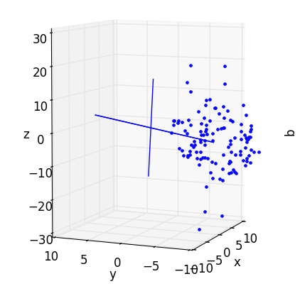
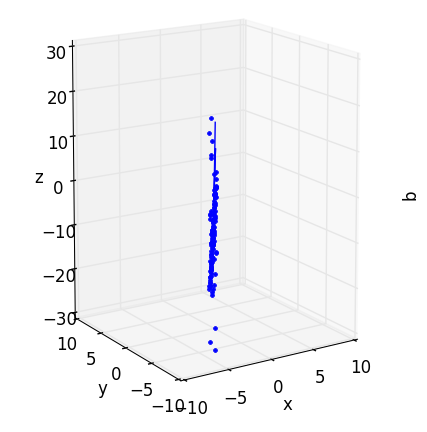
Second, the subplot “AFTER” projection looks quite a bit like the “BEFORE” image in the 3D axes. We may not be able to swivel it around, but if you turn the high-dimensional data so that it’s flat face is facing toward you, you will have effectively recreated the “AFTER” plot in the “BEFORE” axes (you may need to use the zoom widget to correct the scales).
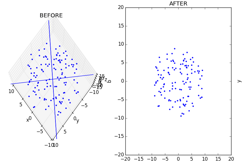
The takeaway message here is that PCA is ultimately just a linear projection (or flattening) of data in one space into some other space. Nothing is intrinsically different – it is merely squished. However, when we start dealing with more dimensions (and we’re forced to view 2D/3D projections of bigger data) the myriad projections we choose to get an impression of the data may all look quite different. In such cases, the ability to compare before and after images (perhaps plotting different projections of the data rather than rotations) can be instrumental.
And third, the “variance by components” plot is very boring. Because we’re plotting an almost perfect disc, the “direction of greatest variance” we use as the first PC has only marginally more variance than the second component. We can spice it up by using pca_disc’s stretch function to skew the data and watch as the graph becomes less even. But as always, the real intrigue happens when we add more dimensions.
High-Dimensional Data
For most real-world datasets, dimensionality reduction involves sacrifice. Every principal component captures a bit of variance and somewhere along the line, the user must make a judgment call about how much of that variance it is okay to throw out if it means getting to weasel into a lower dimension. The subjectivity of this process is why visual diagnostics tools can play such an important role in dimensionality reduction. Good analyses rely on the ability of informaticians to make informed decisions and Fovea is a great informer. By interacting with data, testing different candidate dimensionalities, and observing the associated “variance payoffs”, users can make better choices for a dimensionality reduction.
Consider how our workflow changes as we move into higher dimensions. Imagine you are a psychologist acutely interested in how frequently members of 3 different populations (children, adolescents, and adults) experience 6 different emotions (joy, sorrow, jealousy, malice, fear, and pride) throughout the day. For convenience, we’ll pretend also that each population’s data can be modeled perfectly as a normally-distributed hypersphere in 6D emotion-space. Now instead of having three rotations of a disc shown in three different colors, our dataset will consist of three distinct hyperspheres (created with synthetic_data()) representing the emotional diversity of children (red), adolescents (green) and adults (blue):
# Create and stretch different hypersphere "clusters":

X1 = translate(stretch(stretch(sd.generate_ball(133, dim, 10), 0, 1.4), 1, 1.4), 0, 25)
X2 = translate(sd.generate_ball(110, dim, 10), 1, 20)
X3 = translate(noise(sd.generate_ball(95, dim, 10), 2, 0.6, 0, 2), 2, 15)

X = [X1, X2, X3]

clus_layers = ['clus1', 'clus2', 'clus3']
clus_styles = ['r', 'g', 'b']
Notice that I’ve also tinkered with the number of datapoints making up each hypersphere (the sample size of that population) and applied pca_disc’s stretch(), translate() and noise() function to give each cluster its own character, as we would expect from three different clusters of a real dataset.
Let’s say we suspect our choice of 6 emotions was somewhat arbitrary. Do we really need to give “joy” and “pride” their own axes, or should reports of those feelings all be lumped into a single variable (happiness)? For that matter, don’t “jealousy” and “malice” belong to the same underlying emotion (contempt) as well? PCA is designed to settle questions like these.
But a problem arises when the best set of axes PCA does identify outnumbers the 3 dimensions visible to us mortals. We may have narrowed our 6 emotions down to a more manageable list of 4 (happiness, contempt, fear, sorrow), but that’s little solace if we wish to plot our new dataset in 2D or 3D. However, we may still get a loose impression of how 4D or 6D might look in its natural state by projecting it onto 2 or 3 orthonormal vectors. Methods like Linear Discriminant Analysis can be used to come up with “projection vectors” that yield particularly informative projections of high-dimensional data. But purely for the sake of demonstration, we’ll content ourselves with any 2 or 3 orthonormal projection vectors that transform our 4D (“AFTER”) and 6D (“BEFORE”) into 2D and 3D point-clouds that can be drawn in our existing subplots. Two arbitrary orthonormal projection vectors can be found by applying the QR factorization on a random matrix as in pca_disc’s function, ortho_proj_mat():
def ortho_proj_mat(n, m):
    Z = numpy.random.rand(n, m)
    Q, R = numpy.linalg.qr(Z)
    return Q
However, when dealing with 6D data, there is more leeway to select how many axes we want our new space to have. For this particular example, the third subplot reveals a sharp gap between the variance explained by the first 2 PCs and the remaining 3 for the X1 (red) dataset.
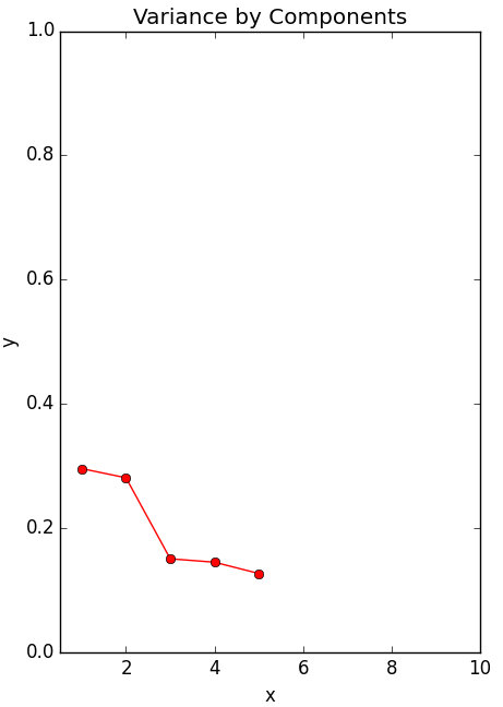
If this were real psychological data, we might conclude that we were too hasty to settle on four new dimensions, when what we really needed was just a “positive emotion” axis and a “negative emotion” axis. Then again, even if two vectors explain a big portion, we would still be throwing out a lot of variance if we ignore the other 3 completely. In other words, the process of picking the best dimensionality is non-deterministic, context-dependent, and leaves room for trial and error.
Wouldn’t it then be nice if we could manually select the number of PCs we want to project our data onto and explore how our choice affects the “AFTER” image? By including “up” and “down” arrow clicks in our keypress() function we can do just that. Each time we press the “up” key, another PC is added to the set of axes onto which the “BEFORE” data are projected (thus changing the appearance of the “AFTER” plot). Each time we press “down”, a PC is removed. And if the current number of selected PC’s exceeds two, the code swoops in with our arbitrary, orthonormal, projection vectors to display the data in the second subplot.
However, as we flit around dimensions, generating different “AFTER” data, and projecting what we find onto our random QR-vectors, we end up with a lot of different variables to keep track of. For instance, even if our projection vectors for displaying 4D data are chosen arbitrary, we still want them to be the same vectors if we hop over to 5D-land for a bit, then come back. Otherwise, viewing the different plots produced by toggling through different dimensions is about as informative as randomly generating the data each time.
Fortunately, Fovea’s object-oriented design makes it easy to add new classes that store and reuse attributes during interactive plotting sessions. Reworking a bit of code from Benjamin Root’s Interactive Applications Using Matplotlib, we can come up with a control system class, ControlSys, whose fields include:
- d (the number of PC’s we wish to start with)
- c (a counter for keeping track of which hypersphere is on display)
- proj_vecsLO (Two orthonormal vectors for projecting post-PCA data)
- proj_vecsHI (Three orthonormal vectors for projecting pre-PCA data)
This class also includes a modified version of our function, keypress(), which now cycles between layers/clusters (left and right), re-computes PCA in different dimensions (up and down), and changes visibilities (m and h).
def keypress(self, event):

    if event.key == 'left' or event.key == 'right':
        if event.key == 'left':
            self.c += 1
        else:
            self.c -= 1

    for layer in self.clus_layers:
        plotter.setLayer(layer, display= False)

    plotter.toggleDisplay(layer=self.clus_layers[self.c%len(self.clus_layers)]) #figure='Master',

    if event.key == 'm':
        for layer in self.clus_layers:
            plotter.toggleDisplay(layer, figure='Master')

    if event.key == 'h':
        plotter.toggleDisplay(layer='orig_data', figure='Master')

    if event.key == 'up' or (event.key == 'down' and self.d is not 2):
        if event.key == 'up':
            self.d += 1
        elif event.key == 'down':
            self.d -= 1

    print("Attempting to display", self.d,"-dimensional data...")

    for i in range(len(self.clus_layers)):
        self.data_dict = compute(self.data[i], self.d, self.clus_layers[i],
            self.clus_styles[i], self.proj_vecsLO, self.proj_vecsHI)

    self.highlight_eigens()
    gui.current_domain_handler.assign_criterion_func(self.get_projection_distance)

    plotter.show(rebuild=False)
Note also the print statement and highlight_eigens() function, called when the up or down keys are pressed. Each cues the user to the effects their changes of dimensionality has. In the case of the print statement, this cue is text. In the case of highlight_eigens(), vertical bars are drawn through each component in the “Variance by Components” currently being viewed. Another more subtle indication of the current dimensionality is the number of colored axes visible in the “BEFORE” plot, which will always be the same as the number of vertical bars.
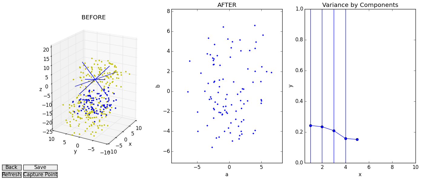
The end result is a system that lets the user move “horizontally” through different clusters of data and “vertically” through candidate dimensionalities for the reduced data. We can view the variance subplot or printed reports of variance captured to find our low-dimensional sweet-spot, all while referring to the “BEFORE” and “AFTER” images as sanity checks.
Adapting This Example To Your Application
As much as I hope you enjoyed this meditation on discs and hyperspheres, it is unlikely that you installed Fovea to process reams of conveniently-gaussian, made-up data. For that matter, it is unlikely you’ll be satisfied exploring whatever data you do have with PCA alone. So I’ll close out with a few comments about the overall design of the PCA visualization module and some simple ways you might repurpose it to meet your needs.
This user example is divided into two files: pca_disc and pca_tester. pca_tester is the end where most of the user’s interaction with the code is meant to occur. It includes the disc and hyphersphere functions already discussed, but both should serve as a template for how to load real data into the pca_disc’s control system and library of dimensionality reduction tools. For instance, instead of generating data with generate_ball() and the rotation functions, X could be created from a delimited .txt file with numpy.loadtxt(). Say you’ve used a classifier to group some set of feature-vectors into different clusters. Just as we displayed three disc rotations in three different colors, so too could you explore clouds of “Iris Setosa”, “Iris Vesicolour” and “Iris Virginica” instances in red, green and blue.
The three-subplot configuration is also natural to other machine learning paradigms besides PCA. All dimensionality reductions involve three things: a source (high-dimensional) data set, a reduced (lower-dimensional) data set, and some criterion that needs to be optimized in order to generate the reduced data from the source. In PCA, this criterion is variance. But there’s no reason why you might not reserve the third subplot for Kullback-Leibler divergence while using t-SNE, or mean geodesic distances between points in Isomap. Swapping out PCA for another algorithm will take a bit of digging in the “backend” functions of pca_disc, but only these few lines of code in compute() assume that you’re interested in using PCA at all:
p = da.doPCA(X, len(X[0]), len(X[0])) #Creates a pcaNode object.

pcMat = p.get_projmatrix()

plotter.addData([range(1, len(p.d)+1), p.d/sum(p.d)], layer=layer, style=style+"-o", subplot= '13')

Y = p._execute(X, new_dim)
Finally, maybe your data aren’t already clustered, so there’s nothing to toggle between with the left or right arrow keys. Or maybe you already have your heart set on a specific dimensionality, so paging up and down is no good to you. Fortunately, the keypress() function in pca_disc’s ControlSys can be easily modified with a conditional block to patch in whatever key commands do interest you. For example, if you’re curious about how your high-dimensional data might look from many, many different angles, you might modify keypress() to rotate your “BEFORE” projection vectors with presses of the left and right arrow keys and “AFTER” projection vectors by pressing up and down. Instead of having a tool for probing different candidate dimensionalities during a dimensionality reduction, you would then have a GUI in the vein of DataHigh, a MATLAB package which lets users explore high-dimensional data with continuous, 2D projections once the reduction is over.
Myriad other methods could be added to ControlSys to assist in analyses of the core objects captured in the class fields. For instance, I’m now working on integrating some of the tools from domain2D into the PCA user example. A function for growing a bubble around “AFTER” points that needed to be projected an especially long distance during PCA might look a little like this:
def get_projection_distance(self, pt_array):
    """
    Domain criterion function for determining how far lower dimensional points
    were projected
    """

    nearest_pt = []
    index = []

    #Find closest projected point.
    dist = 10000000
    for i, row in enumerate(self.data_dict['Y_projected']):
        if numpy.linalg.norm(pt_array - row) < dist:
            dist = numpy.linalg.norm(pt_array - row)
            nearest_pt = row
            index = i

    #Calculate distance between projected point and loD point.
    orig_pt = self.data_dict['Y'][index]
    proj_pt = numpy.append(nearest_pt, np.zeros(len(orig_pt)-len(nearest_pt)))
    if numpy.linalg.norm(orig_pt - proj_pt) > self.proj_thresh:
        return -1
    else:
        return 1
Even if you don’t care to manipulate your GUIs with fancy callbacks and widgets, the ControlSys class is a great place to define scripting methods that let you interact with your applications’ important fields in real-time.
Conclusion
Hopefully this walkthrough has given you a more visual understanding of PCA, but the moral of the story is that this framework is general-purpose and applicable to many data science tasks. Layers can be used to group related data and meta-data and make this information available in a number of formats. Setting up GUIs and callbacks is made easy, but advanced users retain the freedom to interact with their data through scripts and command line inputs. Fovea is an interactive, graphical toolkit, not simply a GUI. It gives would-be dimensionality reducers a view inside whatever black boxes interest them.